Step 3: Explore the data
Open the appropriate data file from your instructor to see the melting times for both chips for each person.
Because the data are paired, the most appropriate way to analyze the data is to look at the differences in the response for each observational unit.
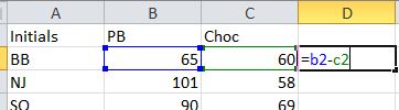
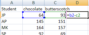
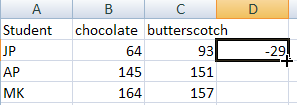
- In Excel, create a formula to calculate these differences by clicking in the D2 cell and entering: =b2-c2 (with the equal sign).
- Press Enter/Return and the difference in melting time (%chip1type% - %chip2type%) will be calculated for the first student.
- Now, place your mouse back on the D2 cell and double click on the square in the lower right corner.
This will fill in that formula for the rest of the column.
- Name this column: differences
|
|
Now select, copy, and paste the column of differences into the Descriptive Statistics applet below. (Clear the existing data, copy and paste the D column from the Excel file, copy and paste into the Sample data box and press Use Data.)
Decide whether you want to use the dotplot or the hitogram and also check the Boxplot box.
- Select Cols > New Column
- Specify difference as the Column Name
- Press OK.
- Click on the column to highlight it
- Then select Cols > Formula
- Click on pb column then the minus sign then choc column to specify the formula for the differences.
- Press OK.
|
 

|
Produce graphical and numerical summaries of these time differences (Hint: Analyze > Distribution, using only the column of differences. Look at the Resources page (e.g., Lab 3) if you need more reminders. Remember to add a horizontal axis label and a meaningful title. After you create the graph, use the pull-down menu next to your difference window title and choose Continuous Fit > Normal to overlay a normal model on your sample distribution.)
- In Excel, enter the formula for computing the differences in D2
- Then "fill" that formula down the column by clicking in that cell and then placing the cursor over the lower right corner until it turns into a black "plus" sign and then double click on that corner.
- Name the column
- Then copy and paste the column of differences into the Dotplot Summaries applet to produce a graphical summary of the responses. Display the mean and standard deviation.
|   |
Make a screen capture of the dotplot or histogram (and boxplot) of the differences including the mean and SD values. You may want to call the sample mean difference and sample standard deviation  and sd respectively to remind yourself that they were calculated about the time differences. Give the graph a title/caption, including clarification of the direction of subtraction.
(c) Write a paragraph (in context) summarizing the behavior of the distribution of the differences (e.g., shape, center, spread, unusual observations) and what they reveal about any tendencies for one chip to melt faster than the other. (You may want to save the write-up of this question for later.)